 icon refreshes the dashboard. The newly displayed dashboard will reflect any changes since the last time the dashboard was refreshed.
The Dashboard provides a summary total count of Candidate Status, Available and Source.
You can click on the Column (or whatever data visualization tool you use) in the Total Recruited by Branch chart to display the Candidate Count by Branch linked report. See the Linked Report Actions section below for information on the Linked Report.
The following sub-topics are covered. You can scroll down the page to see each sub-topic or click on the link below to be taken directly to that sub-topic:
To access this dashboard from Reporting & Analytics:
From the main Navigator Bar, select Reporting.
From the drop-down menu, select Reporting & Analytics.
From Reporting & Analytics page, select System Reports in the Folder/Report navigator.
In the System Reports folder, select the Recruiter folder.
In the Recruiter folder, select the Dashboard - Candidate Summary by Input Date folder.
In the Dashboard - Candidate Summary by Input Date folder, single-click on 01 Candidates Summary by Input Date and click on the Run Selected Report icon. Alternatively, you can right-click on 01 Candidates Summary by Input Date and select Run Report.
The 01 Candidates Summary by Input Date is divided into 4 areas:
Total Recruited by Branch chart:
To learn how to run this sub-report on its own, click here.
This chart displays the total number of Candidates recruited (based on filtering criteria) for the select branches. The number of Candidates recruited is displayed on the Y-axis and Branches are displayed on the X-axis. By default, this is a column chart.
You can click on the Column (or whatever data visualization tool you use) in the Total Recruited by Branch chart to display the Candidate Count by Branch linked report. See the Linked Report Actions section below for information on the Linked Report.
Candidate Status chart:
To learn how to run this sub-report on its own, click here.
This chart shows the percentages of recruited Candidates at each Status (e.g. Applicant, Employee, Placed). By default, this is a pie chart.
Source chart:
To learn how to run this sub-report on its own, click here.
This chart displays the percentages of Candidates recruited from various sources. By default, this is a pie chart.
Availability Status:
To learn how to run this sub-report on its own, click here.
This chart shows the percentages of recruited Candidate at each Availability Status (e.g. Available, Retired, On Assignment). By default, this is a pie chart.
In the upper left corner of the dashboard, the icon refreshes the dashboard. The newly displayed dashboard will reflect any changes since the last time the dashboard was refreshed.
Changing the Dashboard Filters
The  icon allows you to change the filters on the dashboard.
For this dashboard, you can edit the following filters:
Candidate Input Date: By default, the Condition is "In Between" and the "From" Date defaults to the first day of the current month. The "To" Date defaults to the last date of the current month.
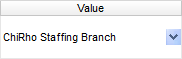
Candidate Branch: By default, the Condition is "Is One Of" and the Value defaults to the logged-in User's Default Branch.
For each filter, you can change the Condition and Value of the filter. The specific options you can choose from depend on a variety of factors including the type of data (date, currency, text, etc.), branch security access and other factors.
NOTE: Changes made to the filtering criteria do NOT persist. In other words, when you leave the dashboard and return to it, all default filters are re-applied.
Condition
You can use the following Conditions:
Equal To: Data must be equal to the Value. There is only 1 Value option.
Not Equal To: Data must NOT equal the Value. There is only 1 Value option.
Less Than: Data must be alphabetically, numerically or date-wise before the Value. There is only 1 Value option.
Less Than or Equal To: Date must be equal to the Value or alphabetically, numerically or date-wise before it. There is only 1 Value option.
Greater Than: Data must be alphabetically, numerically or date-wise after the Value. There is only 1 Value option.
Greater Than or Equal To: Name must be equal to the Value or alphabetically, numerically or date-wise after it. There is only 1 Value option.
Starts With (does not apply to Input Date): Data must start with the Value. There is only 1 Value option and the data entered can be as little as a single character.
Not Starts With (does not apply to Input Date): Data must not start with the Value. There is only 1 Value option and the data entered can be as little as a single character.
Ends With (does not apply to Input Date): Data must end with the Value. There is only 1 Value option and the data entered can be as little as a single character.
Does Not End With (does not apply to Input Date): Data must not end with the Value. There is only 1 Value option and the data entered can be as little as a single character.
Contains (does not apply to Input Date): Data must contain the Value. There is only 1 Value option and the data entered can be as little as a single character. NOTE: If you enter more than one character in the Value, the characters in the data must appear in the same order.
Does Not Contain (does not apply to Input Date): Data must not contain the Value. There is only 1 Value option and the data entered can be as little as a single character. NOTE: If you enter more than one character in the Value, the characters in the Data must NOT appear in the same order.
Is Between: Data must be alphabetically, numerically or date-wise between the two listed Values (inclusive). There are two Value options. The first (upper) value is the "From" value . The second (lower) value is the "To" value.
Is Not Between: Data must not be alphabetically, numerically or date-wise between the two listed Values (inclusive). There are two Value options. The first (upper) value is the "From" value . The second (lower) value is the "To" value.
Is One Of: Data must be one of the Values listed. You may select multiple Values. See the section on Values below for adding multiple values to the Values column.
Is Not One Of: Data must not be one of the Values listed You may select multiple Values. See the section on Values below for adding multiple values to the Values column.
Value
IMPORTANT: For performance purposes the following two items should be noted when using the Values droplist. First, in order to enhance performance, once a value is selected, the droplist only displays those items alphabetically/numerically AFTER the selected item. To see all items again, delete the value (select it and press Delete on your keyboard) and then use the droplist. All items will display. Second, in order to enhance performance, the droplist only displays a set number of records. If the list of possible values is longer than the displayed list, select the name at the bottom of the list as the value. When you next click the droplist, the rest of the items display.
<Blank>: By selecting the text in the Value column and deleting it, the Dashboard returns all possible Values.
Single Value: To select a single value, click the droplist and select the item from the list.
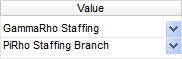
Double Values: To select two values, click the droplist on each value and select the item from the list.
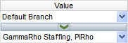
Multiple Values: To select multiple values, click the top droplist to select a value to add to the list. You can also type in the name of the branch and then click the middle arrow to add it to the list. To see the items on the list, click the lower droplist. To remove an item from the list, click the red X to the right of the item.
The following actions are accessed by either right-clicking or left-clicking anywhere within the chart area.
NOTE: Changes made to the chart do NOT persist. In other words, when you leave the dashboard and return to it, all default chart settings are re-applied.
Right-Click Actions
Type: This option allows you to change the type of chart displayed. Options are Line Types, Bar Types, Column Types and Pie and Other Types. Once you click on one of the Types, you are given additional options. For example, if you select Line Types, additional options are Line, Spline, Area and Spline Area. Click on the option you want and the type of chart changes instantly.
You can also select to use 3D Style or not by clicking the Use 3D Style checkbox. 3D style gives the chart depth. Otherwise, the chart displays in flat 2D.
Theme: This option allows you to select from several pre-set themes. A theme changes the overall look of the chart (mainly by changing the colors on the chart).
One option is Linear Range. This allows you to select a starting and ending color. The chart then displays lines, bars and columns using a range of colors between the starting and ending color.
Legend Location: This option allows you to determine where you want the chart's legend located. Options are None (no legend), Right and Bottom. NOTE: This option is not available if the chart does not have a legend by default (e.g. Total Recruited by Branch).
Sort By: This option allows you to select how items in the chart are sorted. Select Report Order to follow the order of information on the sub-report (in either ascending or descending order). Select Data Labels to sort the chart by the data labels (in either ascending or descending order).
Left-Click Actions
: Use this icon to refresh the data on the chart. The newly displayed chart reflects any changes since the last time the chart was refreshed (new activities, User changes, etc.). NOTE: This only impacts the specific chart. To refresh the entire dashboard select the icon in the upper-left corner of the dashboard.
 : Use the droplist next to this icon to export the information in the chart to a variety of formats.
 : Excel
 : PDF (Portable Document Format)
 : RTF (Rich Text Format)
 : CSV (Comma Separated Values)
NOTE: Once you select one of the above options, you will have the option to open or save the newly formatted table. In the Dashboard itself, click Close on the small dialog that displays. You will also notice that a new tab has been added to the Dashboard. You can close this tab.
Clicking on the Data Visualization (e.g. Column, Bar) in the Total Recruited by Branch chart displays the Candidate Count by Branch linked report.
This report displays information about each employee recruited by the Staffing Service Branch. Information includes Employee Name, Recruiter, Candidate Status, Availability Status, Source, UDF information and more.
You can click on the link in the Employee Name column to jump to the Employee record. NOTE: Jumping to a record exits the Reporting & Analytics page and all unsaved changes on open tabs are lost. Therefore, Bond recommends first saving all unsaved data and THEN jumping to a record.
The linked report also has the following option:
Execute Selected Report: This executes the report in the format displayed. For example, if you click the Excel icon, the report will execute in Excel format. If you want to select a different format, use the droplist to select from:
: Excel
: PDF (Portable Document Format)
: RTF (Rich Text Format)
: CSV (Comma Separated Values)