This is a sub-report used by 01 Candidates Summary by Input Date. This chart displays the total number of Candidates recruited (based on filtering criteria) for the select branches. The number of Candidates recruited is displayed on the Y-axis and Branches are displayed on the X-axis. By default, this is a column chart.
You can click on the Column (or whatever data visualization tool you use) to display the Candidate Count by Branch linked report. See the Linked Report Actions section below for information on the Linked Report.
The following sub-topics are covered. You can scroll down the page to see each sub-topic or click on the link below to be taken directly to that sub-topic:
This report can be executed in the following formats:
HTML
Excel
PDF (Portable Document Format)
RTF (Rich Text Format)
CSV (Comma Separated Values)
To access this report :
From the main Navigator Bar, select Reporting.
From the drop-down menu, select Reporting & Analytics.
From Reporting & Analytics page, select System Reports in the Folder/Report navigator.
In the System Reports folder, select the Recruiter folder.
In the Payroll folder, select the Dashboard - Candidate Summary by Input Date folder.
In the Dashboard - Candidate Summary by Input Date folder, single-click on Candidate Count by Branch and click on the Run Selected Report icon to run in HTML format or the Export Report icon to export the report. Alternatively, you can right-click on Candidate Count by Branch and select Run Report to run in HTML format or Export As > and then the format.
This report uses the Advanced Report Filters control. This control allows you to add filters, change filter logic, etc.
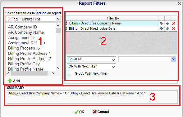
The Advanced Report Filters Control
The Advanced Report Filters Control is made up of 3 areas:
Area 1: The first area lists all fields that can be selected as a filter. The droplist at the top allows you to select the Category. Once you select a Category, the area below it displays the fields associated with that Category. To add a field as a filter, select the field from the list and then click Add. The field is added to the filter list in Area 2.
Area 2: The second area lists all current filters. You can rearrange the order of the filters by using the up and down arrow icons to the right of the filter field. You can remove a filter by clicking the red "x".
Below the filters (where it reads "Equal To" in the screen shot), you can select the filter Condition (see below a list of conditions applicable to each defaulted filter). Next to it, you can select the value to which the Condition applies. For example, if your filter is Company Name and the Condition is "Equal To" then the selection you make in the value drop list (which will be a list of Company Names) determines the Company Name selected for the reprint.
Below the Condition and Values fields is the Logic selection. This determines whether the current filter will interact with the filter under it in the filter list using AND or OR logic. AND logic makes sure that both filter's Conditions and Values are met in order to include it on the report. OR logic includes data that matches EITHER the current filter's Conditions and Values OR the next filter's Conditions and Values.
Below the Logic selector is a checkbox that allows you to group filter items. Essentially, in terms of a logical statement, this puts a parenthesis around multiple filters. For example, the logical sentence "A and (B or C)" indicates that data will be selected if it is associated A and EITHER B or C.
Area 3:The final area displays the logical sentence you are creating based on your selections in Area 1 and Area 2.
Defaulted Filters
Input Date: The Date on which the Candidate was input into the system. You may change both the Condition and the Value. The Value depends on the Condition selected.
The following conditions are available:
Equal To: Date must be equal to the Value. There is only 1 Value option.
Not Equal To: Date must not be equal to the Value. There is only 1 Value option.
Less Than: Date must be earlier than the Value. There is only 1 Value option.
Less Than or Equal To: Date must be earlier than or equal to the Value. There is only 1 Value option.
Greater Than: Date must be later than the Value. There is only 1 Value option.
Greater Than or Equal To: Date must be later than or equal to the Value. There is only 1 Value option.
Is Between: Date must be between the two selected dates (inclusive). There are two Value options.
Is Not Between: Date must not be between the two selected dates (inclusive). There are two Value options.
Is One Of: Date must match one of the selected dates. There are multiple Value options.
Is Not One of: Date must not match any of the selected dates. There are multiple Value options.
You have the following Value options:
IMPORTANT: For performance purposes the following two items should be noted when using the Values droplist. First, in order to enhance performance, once a value is selected, the droplist only displays those items alphabetically/numerically AFTER the selected item. To see all items again, delete the value (select it and press Delete on your keyboard) and then use the droplist. All items will display. Second, in order to enhance performance, the droplist only displays a set number of records. If the list of possible values is longer than the displayed list, select the name at the bottom of the list as the value. When you next click the droplist, the rest of the items display.
<Blank>: By selecting the data in the Value column and deleting it, the Dashboard returns all possible Values.
Single Value: To select a single value, you can click the Calendar icon to display a Calendar control allowing you to select a date. click the droplist and select the item from the list. You can click the down-arrow to select from a list of dates. You can also click the function icon (fx) to select from a list of relative dates (see below).
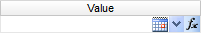
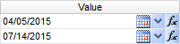
Double Values: To select two values, click the desired icon (see above) on each value and select the date.
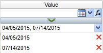
Multiple Values: To select multiple values, click the desired icon on the top field to select a date to add to the list. You can also type the date and click the middle arrow to add it to the list. To see the items on the list, click the lower droplist. To remove an item from the list, click the red X to the right of the item.
You can enter a date one of 4 ways:
Type in the date (e.g. 02/14/2015).
Use the calendar control ( ) to select a date.
Use the drop-list ( ) to choose from a list of invoice dates (based on the other filtering criteria you've selected).
Use the function icon ( ) to select from the following (all examples are based on Tuesday, July 14th, 2015 date):
Today: Inserts today's date (July 14, 2015).
Tomorrow: Inserts tomorrow's date (July 15, 2015).
Yesterday: Inserts yesterday's date (July 13, 2015).
Today Plus 7/30/60/90 Days: Inserts the day 7, 30, 60 or 90 days in the future (60 days = September 12, 2105).
Today Minus 7/30/60/90 Days: Inserts the day 7, 30, 60 or 90 days in the past (60 days = May 15, 2015).
First Day of Current/Last/Next Month: Inserts first day of selected month (Current = July 1, 2015).
Last Day of Current/Last/Next Month: Inserts last day of selected month (Current = July 31, 2015).
First Day of Current/Last/Next Year: Inserts first day of selected year (Current = January 1, 2015).
Last Day of Current/Last/Next Year: Inserts last day of selected year (Current = December 31, 2015).
First Day of Current/Last/Next Quarter: Inserts first day of selected quarter (Current = July 1,2015).
Last Day of Current/Last/Next Quarter: Inserts last day of selected quarter (Current = September 30, 2015).
Monday of Current/Last/Next Week: Inserts Monday of selected week (Current = July 13, 2015).
Friday of Current/Last/Next Week: Inserts Friday of selected week (Current = July 17, 2015).
Branch: The Branch associated with the Employee.
The following conditions are available:
Equal To: Data must be equal to the Value. There is only 1 Value option.
Not Equal To: Data must not be equal to the Value. There is only 1 Value option.
Less Than: Data must be before the Value alphabetically. There is only 1 Value option.
Less Than or Equal To: Data must be before or equal to the Value alphabetically. There is only 1 Value option.
Greater Than: Data must be later than the Value alphabetically. There is only 1 Value option.
Greater Than or Equal To: Data must be later or equal to the Value alphabetically. There is only 1 Value option.
Starts With: Data must start with the Value. There is only 1 Value option.
Not Starts With: Data must not start with the Value. There is only 1 Value option.
Ends With: Data must end with the Value. There is only 1 Value option.
Does Not End With: Data must not end with the Value. There is only 1 Value option.
Contains: Data must contain the Value. There is only 1 Value option.
Does not Contain: Data must not contain the Value. There is only 1 Value option.
Is Between: Data must be between the two selected Values alphabetically (inclusive). There are two Value options.
Is Not Between: Data must not be between the two selected Values alphabetically (inclusive). There are two Value options.
Is One Of: Data must match one of the selected Values. There are multiple Value options.
Is Not One of: Data must not match any of the selected Values. There are multiple Value options.
The report displays the percentage of each Type of Transaction (e.g. Direct Deposit, Regular Check) for the selected Corporation and Check Date range.
NOTE: Changes made to the chart do NOT persist. In other words, when you leave the chart and return to it, all default chart settings are re-applied.
By hovering over areas of the chart, a pop-up window will display details from that area of the chart.
Right-Click Actions
Type: This option allows you to change the type of chart displayed. Options are Line Types, Bar Types, Column Types and Pie and other Types. Once you click on one of the Types, you are given additional options. For example, if you select Line Types, additional options are Line, Spline, Area and Spline Area. Click on the option you want and the type of chart changes instantly.
You can also select to use 3D Style or not by clicking the Use 3D Style checkbox. 3D style gives the chart depth. Otherwise, the chart displays in flat 2D.
Theme: This option allows you to select from pre-set themes. A theme changes the overall look of the chart (mainly by changing the colors on the chart).
One option is Linear Range. This allows you to select a starting and ending color. The chart then displays lines, bars and columns using a range of colors between the starting and ending color.
Sort By: This option allows you to select how items in the chart are sorted. Select Report Order to follow the order of information on the report (in either ascending or descending order). Select Data Labels to sort the chart by the data labels (in either ascending or descending order).
Clicking on the Data Visualization (e.g. Column, Bar) displays the Candidate Count by Branch linked report.
This report displays information about each employee recruited by the Staffing Service Branch. Information includes Employee Name, Recruiter, Candidate Status, Availability Status, Source, UDF information and more.
You can click on the link in the Employee Name column to jump to the Employee record. NOTE: Jumping to a record exits the Reporting & Analytics page and all unsaved changes on open tabs are lost. Therefore, Bond recommends first saving all unsaved data and THEN jumping to a record.
The linked report also has the following option:
 Execute Selected Report: This executes the report in the format displayed. For example, if you click the Excel icon, the report will execute in Excel format. If you want to select a different format, use the droplist to select from:
 : Excel
 : PDF (Portable Document Format)
 : RTF (Rich Text Format)
 : CSV (Comma Separated Values)